Benjamin Moore Palladian Blue Bedroom

You are probably imagining a shade of blue that either appears like the sky or the ocean – or maybe something very bold and deep – something like the navy blues?
But the truth is – this color is definitely not like any of them.
Benjamin Moore Palladian Blue is actually a soft green-blue paint color that majorly aligns its physical properties with that of a soothing green paint.
It is calm and relaxing – well, definitely reminding me of fern greens!
Even though we call it blue – it somehow has a major tint of greens. Deceiving much, right?
And you would be surprised to know that the color psychology is even more interesting!
But before we get into that – I want to help you understand the true specifications behind the paint color, its appearances, aesthetics, and majorly – if you should use this paint in your home or not!
Symbolic of purity and comfort, this mother of pearl will definitely prove to be a must-try paint in your space.
So, sit back and relax!
I am going to throw off some very interesting insights about this paint that you would absolutely love to know!
Benjamin Moore Palladian Blue HC-144 Details and Specifications

Before you plan to pick this paint for your home, you must remember to go through the color specifications and details.
So, every color has a story to tell – and that is what makes every color so unique!
So, next time – remember there are no two same colors!
Even though they tend to look alike – they can be very different based on the undertones and reflectivity.
So, let's cook some of the details here!
First and foremost, look towards the end of your paint swatches to determine the Light Reflectance Values or the LRV's of the paint color.
This value helps in determining how light or dark the paint is – and you must know this to make informed decisions.
Remember, the greater the value – the lighter the paint and vice versa! On a scale of 1-100, 100 being the lightest!
So, the LRV of Benjamin Moore Palladian Blue is 61.17.

And that means it is a comparatively light-toned blue-green paint color.
Want to try this color out without having to paint your wall? Use some nifty peel-and-stick samples: Pick one up now from Samplize!
Secondly, other important associated terminologies are the RGB and HEX Values that further tell us what the color is made of.
Red = 193
Green = 209
Blue = 201
HEX Value = #c1d1c9
Since we have discussed the technical and scientific information, let's get started with the practical aspects of this quiet Benjamin Moore paint.
How Does this Color Feel in a Space?
Benjamin Moore Palladian Blue feels absolutely calm and relaxing, soothing, and satisfied, and ultra-comfortable and tranquilizing when use in your home.
This paint has deep cooler blue and green undertones that help in releasing stress while calming down space.
So, after a long day of work and sweating – you are quite likely to feel cooler and at peace when you come back home.
And that is why, I highly recommend the warmer and tropical states to incorporate this paint either in the common spaces or even the private rooms.
Moreover, there is certain magic the color plays!
Do you know what that is?
Well, it will help in pushing away your walls – making your space look and feel larger than it is.
How Does Light Affect the Color?
Light tends to play a major role here – just like any other lighter-toned paint!
So, the first step towards picking paint is simply looking around and observing whether your room receives ample natural light or not.
Well, if it does – this paint is quite likely to look lighter than it already is.
Else, for rooms with minimal natural light – the color may appear darker and dull.
On the other hand, you must assure to use this color in the south or west-facing rooms – due to the tranquilization of incoming heat with this cool-toned base.
To truly see what your home's environment and lighting will do here, try out a real paint sample. It takes out the guess work!
What are the Best Coordinating Colors?

As we discussed, just how important it is to analyze the paint is to choose the best complementary colors.
With such confusing colors like BM Palladian Blue – it is comparatively tricky picking a complementary shade.
Since they tend to look blue and green both under certain lighting conditions – it becomes quite a difficult task.
So, here I am going to suggest some interesting hues that play well with this blue-green paint.
First and foremost, you could either choose from a contrasting or a monochromatic color palette – depending upon your interior design style and theme.
In the case of contrasts, you can pick from grays, creamy whites, blacks, charcoal blues, and deep browns.
So, check out these few colors I would recommend for a monochromatic palette!

- 703 Catalina Blue
- 634 Forest Valley Green
- 635 Parsley Snips
On the other hand, here are a few of the colors I would recommend for a contrasting color palette!
- 2159-70 White Cloud
- 2129-40 Normandy
- OC-65 Chantilly Lace – check out my full review here

Remember to pair these with BM Simply White on the trims, moldings, and other decorative architectural features.
BM Palladian Blue Vs Similar Colors
Benjamin Moore provides a wide array of similar-looking options for this paint!
But remember – they may either differ in appearances, undertones, or the reflectivity values.
So, to name a few, the two most similar-looking color options are 702 Bali and 695 Turquoise Mist.
Palladian Blue Vs Bali

BM Bali is another beautiful blue-green paint from the Classic collection!
It is timeless and definitely reminds me of the blue-green waters of Bali! Do you think so too?
With an LRV of 57.94 – it is a given that the paint is comparatively darker than the Palladian Blue!
Order a wall-stick sample of Bali here to help you compare colors in your own space.
Palladian Blue Vs Turquoise Mist

BM Turquoise Mist has an LRV of 60.96 – making it quite closer to reflectivity levels of BM Palladian Blue.
This paint can absolutely play an effective alternative due to its similar undertones and appearances.
Remember to pair it with the same set of contrasting colors as mentioned before!
Do yourself a favor and grab some stick-on sample squares of these two colors and see what looks best in your home.
Where to Use Palladian Blue?
BM Palladian Blue is so serene and welcoming that you can practically use it anywhere in your home – whether living rooms, bedrooms, kitchens, meditation rooms, or bathrooms.
Talking about the interior design style – Benjamin Moore Palladian Blue is a great recommendation for Coastal, Modern, Contemporary, Caribbean, and Cape Cod style.
Try avoiding it in design styles like Country, Farmhouse, and Bohemian styles as they crave a warmer appeal!
Let's see where and how to incorporate this beautiful blue-green color in your home.
Palladian Blue in Living and Dining Rooms
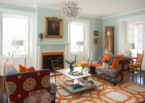
If you want your common spaces to have a cool and crisp backdrop – it is recommended that you choose this relaxing paint color.
It will calm your living rooms and I promise – you would love to spend some time in there.
You can pair it with creamy whites and neutral linen upholstery and bold off-white curtains to add depth.

Furthermore, you can also use black glossy marble around the fireplace – just in case!
Your space is quite likely to feel airy, bright, and enhanced with this paint!
Remember to incorporate warmer wooden textures here for a sense of contradiction in the palette! Although, avoid pine and similar hues.
Using in Bedrooms and Bathrooms
Why not?
Well, Palladian Blue bedrooms are one of the most peaceful ones!
They will exhibit a nice crisp texture in your rooms and help you feel relaxed when you come back to your rooms tired and sleepy.
Furthermore, I recommend incorporating tons of whites in the form of bed frames, nightstands, and even dressers.
Wooden textures and gray suedes and velvets are not a bad option too!
Moreover, using matte black chandeliers would further help in refining the look of your bedroom.
Palladian Blue in Kitchens
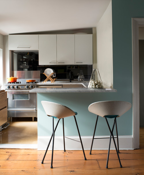
Especially for the open concept plans, if you like a nice tint of cool hue in your kitchen, you can absolutely incorporate this on the cabinetries or the backdrop wall.
Try pairing it with a white or black marble countertop, white hexagonal glossy backsplash, and nickel-tinted fixtures and pull handles. (Avoid Brass)
You can also choose the other way around by painting the backdrop wall in this color and letting the cabinets in Crisp white.
If you have lush hardwood floors installed, it is a plus point!
Using on Exteriors

Palladian Blue on exteriors will further make the color look lighter than it is.
I recommend using this paint on Cape Cod, Craftsman, and Caribbean-styled homes.
Pair it with white, gray, or off-white shaded trims and moldings.
Yes – that way you make a great contrast in your home exteriors!
Also, you can do the other way round, by using whites on the decorative moldings.
An Easy Way to Sample This Color!
Instead of picking up a small can, or worse, an entire gallon can, to "test" out Palladian Blue, you can order a peel-and-stick sample of it from Samplize.
The company is genius – they provide a 12″ x 12″ stick-on square you can put up anywhere in your home to try out a paint color.
For a few bucks, it's definitely worth the small investment so you can see what the color will do in YOUR unique space, with your own lights and shadows.
So, how do you want to use this color in your home? Interiors or Exteriors?
Now that you have all the secrets – are you excited about painting your home in Palladian Blue?
Should there be any questions or thoughts, let me know in the comments below!
Benjamin Moore Palladian Blue Bedroom
Source: https://knockoffdecor.com/benjamin-moore-palladian-blue/


0 Komentar